HUBSTREAM 2016 - Present
It’s hard to describe my work at Hubstream. From one of the first employees, a founder, to a company of over 100. I am in charge of the product. PM, Design, Research, Content, and Support. It’s worth a conversation. Contact me.
To view the Hubstream platform, it’s data visualization, you can visit the Hubstream site below.

2016 and earlier
The Ringtail Platform
As Managing Director of User Experience for FTI Consulting, I was responsible for the direction of the entire platform, key feature areas as an individual contributing designer (most often, the complicated, fun stuff,) and the UX team as a manager.
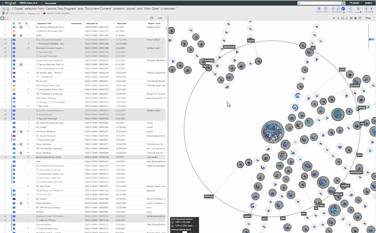
The Ringtail platform consisted of five disparate applications which needed to be combined to make a user successful. While the jewel of the applications was its data visualization (called mapper), it was near impossible for a user to get there. Globally, tasks were confusing and needed to be rethought. UI was duplicated and forked.
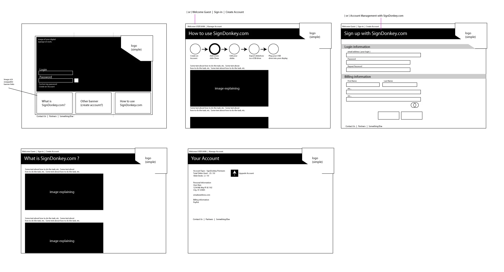
It needed design help, but already had a substantial user-base.
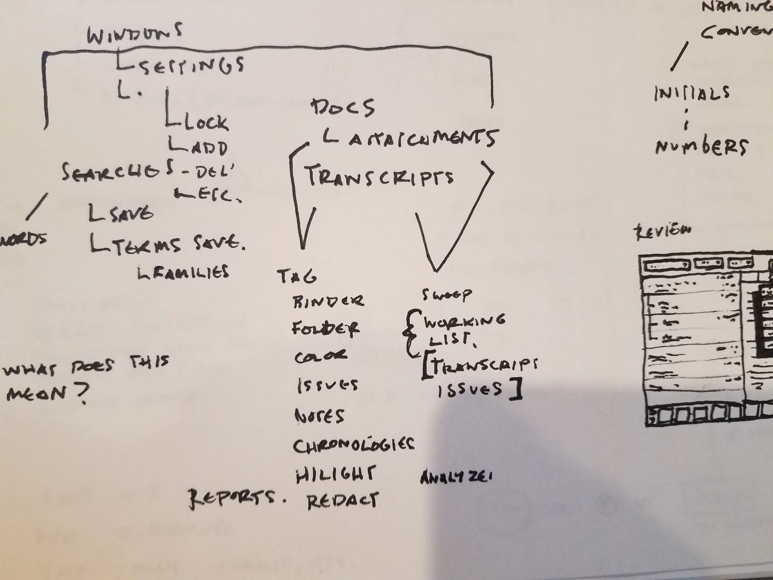
Day one I mapped the applications as they existed, and built out a card-sorting exercise for our users. We needed to know what the global IA would look like. What shape should this application take?

At the end of our card sort, we had a pretty decent idea of the task clustering, and integrated all of the apps to one home screen. The next step was to go through the entire application with an fine-tooth, information-design-shaped comb. The designers on my team and myself split the application up into chunks and went to work.
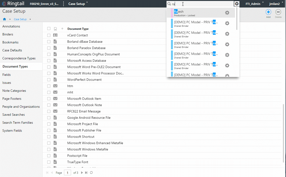
One of my best inventions for the Ringtail application was this simple drop-down. The goal was to allow someone to get to documents 10x faster. Or to a specific document 11x faster. But its simplicity is the beauty. It can search anything in the application both admin and content, with type-ahead search. Fun note: It works so well it scared users at first.
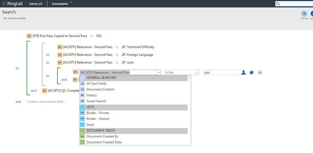
SQL writing interfaces are often the bane of common users and SQL experts alike. What we did here were a few simple things - remove math language (lawyers don't know what "!=" means), use indentation to show grouping, and group things by color (the way the admin user would set it up). We found a huge drop in invalid SQL queries while a big increase in happy users.
Over the next five years, I would spend a large chunk of my time trying to reduce the need for such a tool. But it still proves valuable, and is often cited as one of the product's strengths.

The application all now hangs together. The faceting is from one acquired platform, the lists from another, and the doc viewers were rewritten for speed. Design-wise, this was all a massive exercise in distraction reduction, information architecture, and selection models. It was nerdy UX work at its best.
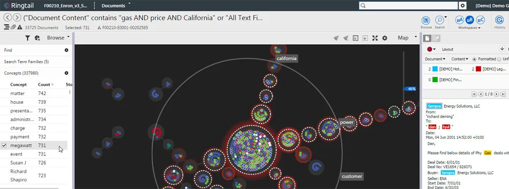
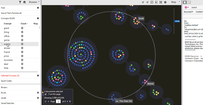
My contribution to the concept map (existing IP) was significant, while leaving its strengths untouched. I added zoom levels, heat mapping, removed a bunch of unnecessary decoration, simplified the hover tool (to be task-based), and legitimately combined the map view with its list-based counterpart.
This again took significant design work on the selection model interactions and the information architecture.
Multi control selection was key for the platform, because of the varied use cases between user communities.
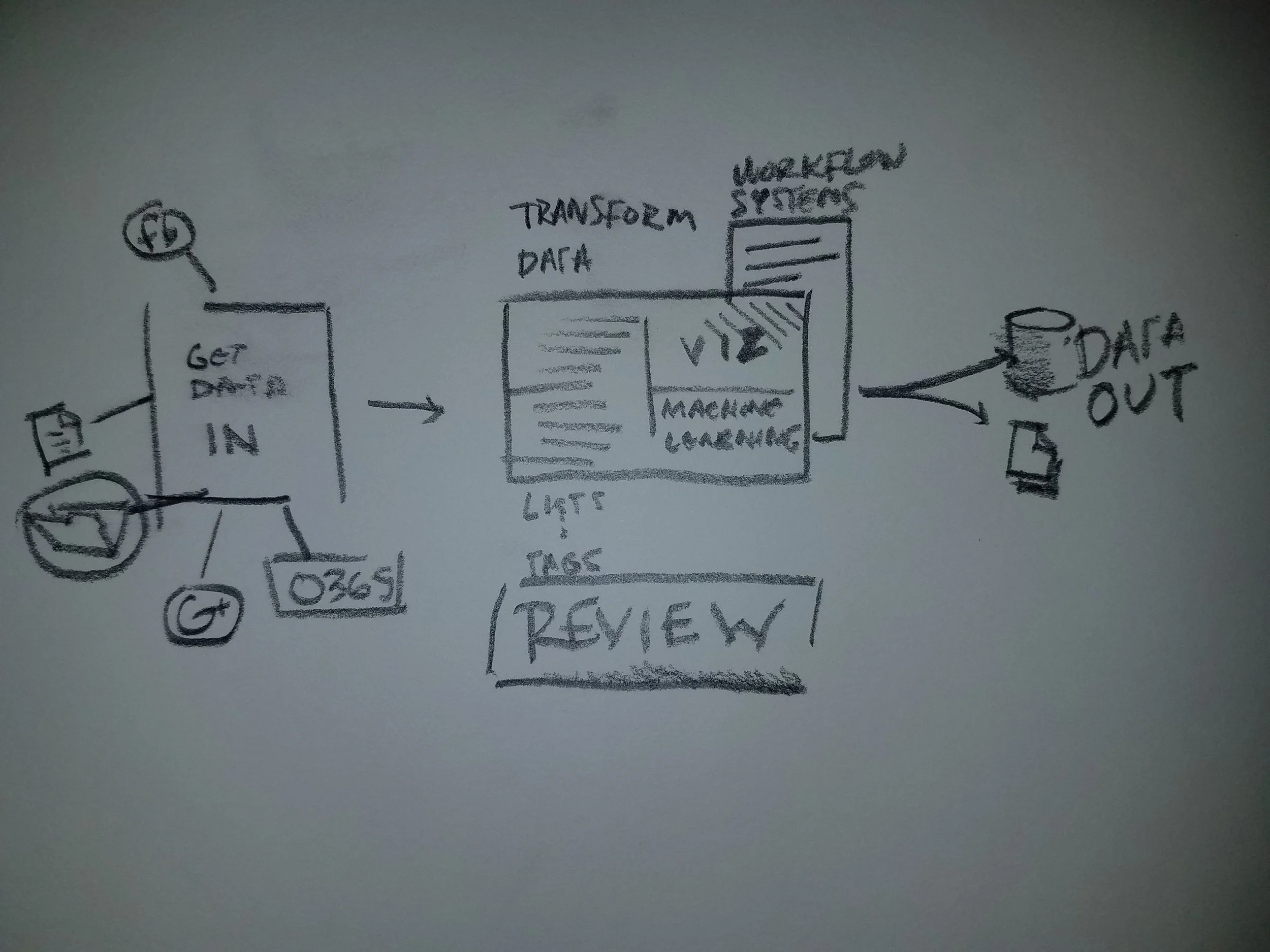
Machine learning for lawyers (and case admins)
When we talk about machine learning in the tech world, it isn't so scary. In the legal domain, users find it terrifying, and for good reason!
I had initially drawn up the idea of creating predictive models on top of Ringtail as a wizard. It would simply walk the user through predefined scripts and call it a day.
The more I thought about it, this would be a missed opportunity to leap-frog our competition. If we could automate a lot of those scripts, layer the data pivots in order of importance, and tie it all to the decision point, it could be pretty spectacular.
Our user data backed-up the idea, as our user-base was not excited about the prospect of running scripts.
We mocked it up, prototyped the interaction, and sold the company on the idea.
Fast forward 3 years later, and almost every case on Ringtail uses our machine learning solution(s). It has won numerous industry awards and is often cited as the best part of the product by our user-base.
This is how these ideas start. Just sketches of what it could be. Most of the time I like to do this on a white board with the dev lead and PM.
One of the first ideas. We ended up throwing it out.
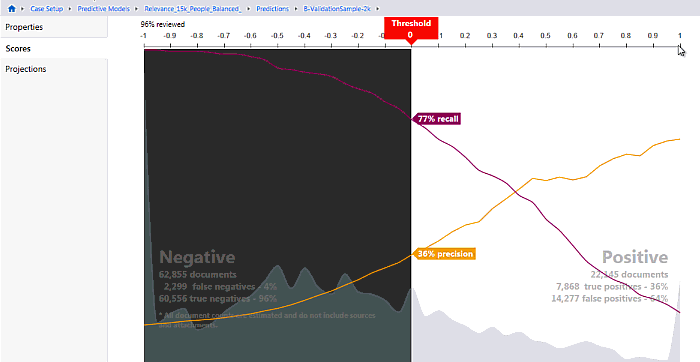
For context, every document accounted for on the left side (Negative) would be a savings. Case admins loved dragging that slider over to save money while balancing a recall the court would allow.
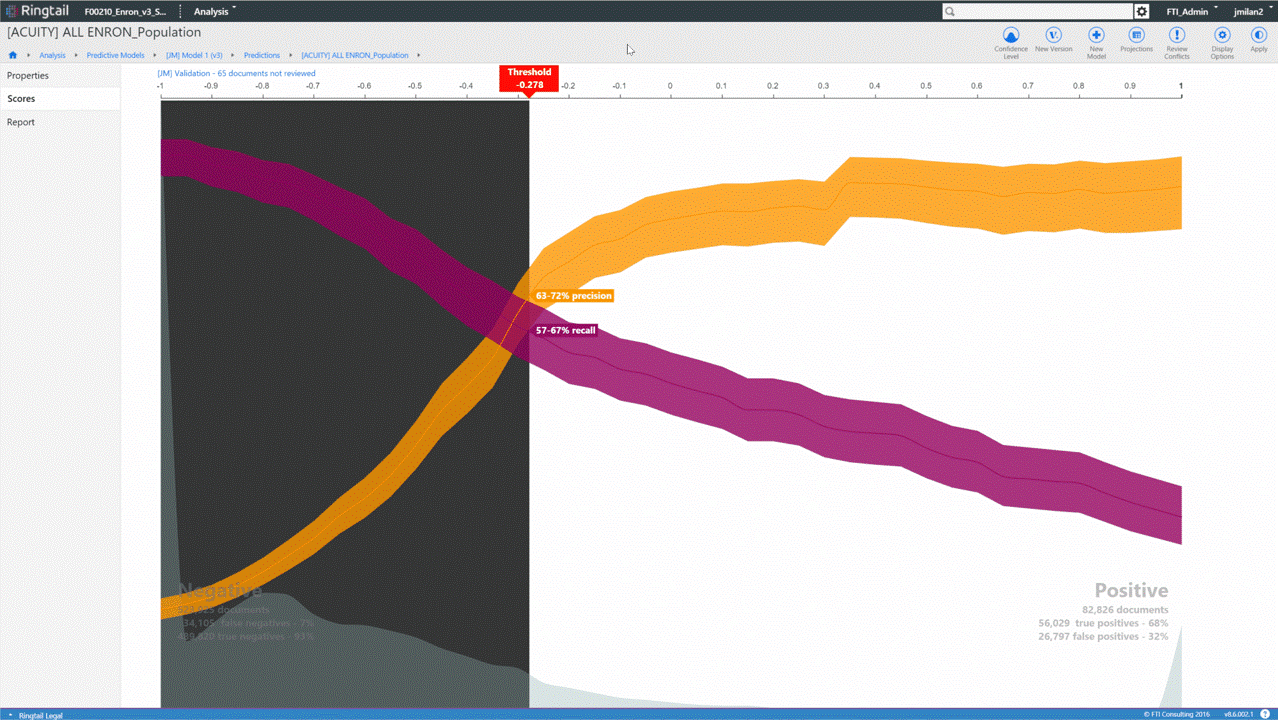
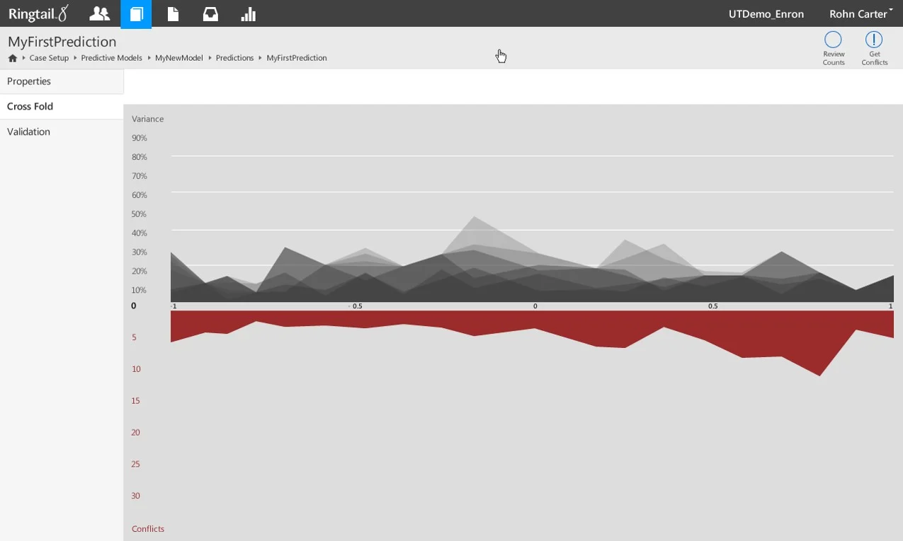
Further updates just built off the visualization.
The king is dead! Long live the king!
Good designers are always looking for ways to obliterate their old work. How do you beat a data-vis like the above? You eliminate the need for it. By automating most of the process, the user no longer needs to be a part of the decision. Rather they just need a report of their progress. The beauty isn't in the report. It's in the removal of large swaths of interface: the reduction of friction.

Simple mobile app for supplement company
I was showing my portfolio to a very talented designer the other day when he bluntly asked, "can you do the easy stuff too?" The question made too much sense. I built this for a startup. I will eventually write all the code for the front end as well.
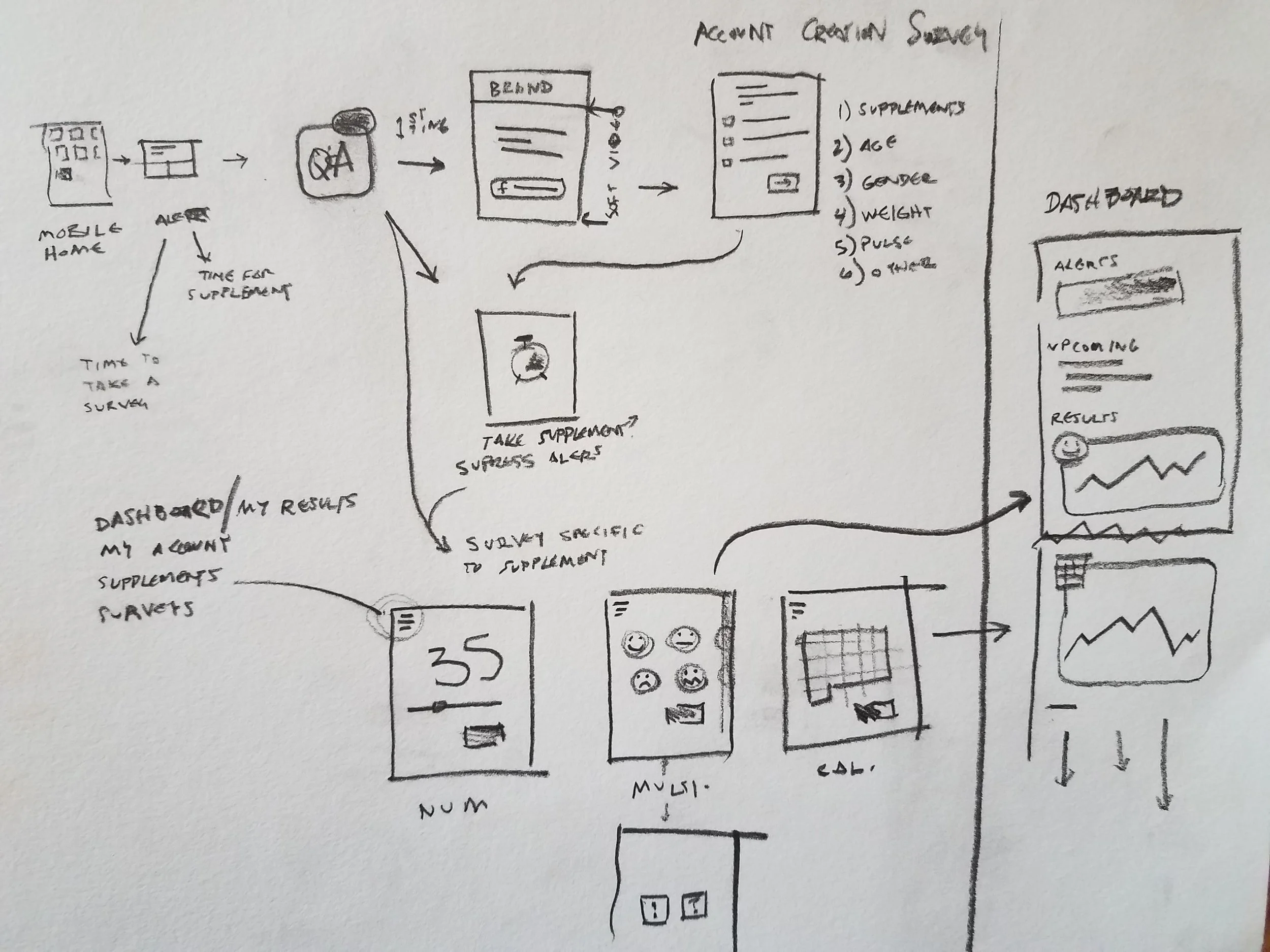
The front end of the system has dynamically generated pages which are very very simple. One decision point per screen.

I mocked this whole flow in Adobe XD. I believe it is the first true UX tool which will be faster/better than old, gross Adobe Fireworks. (Right after they integrate simple bitmap editing.)
Data visualization to stop child exploitation
One of my projects is for a company that helps agencies catch online predators. They followed my basic rules for User Experience so the platform is already pretty good. This visualization will plug directly into that platform and help these guys close more cases, saving more children.
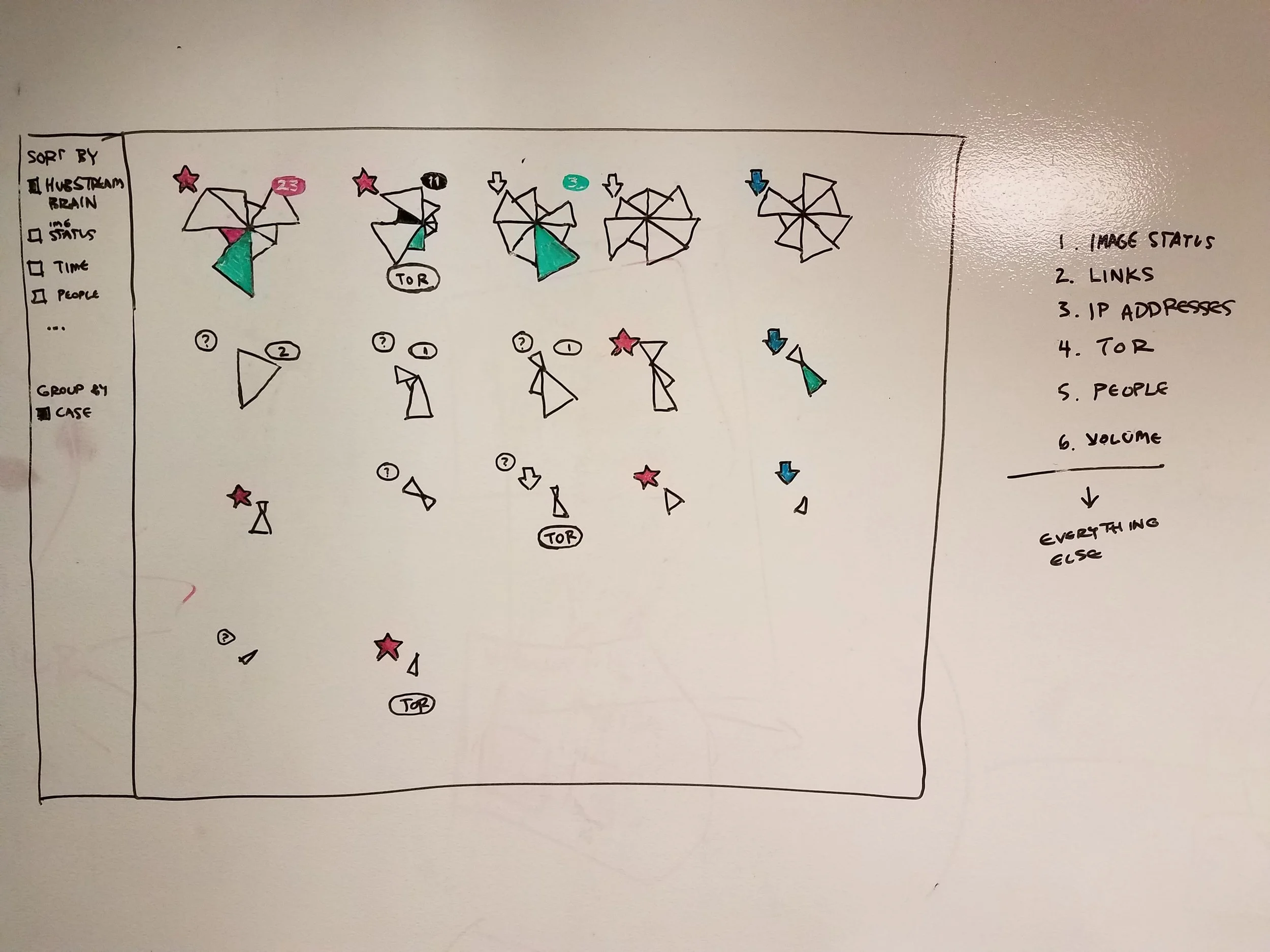
It's important to always keep the primary pivots promoted. Ideally these are connected to the decision point, even if it is just the next step in the process. I like to try out a bunch of different patterns on the whiteboard to see which ones show the cleanest promotion of the aforementioned.
Startup advisement: Sparq
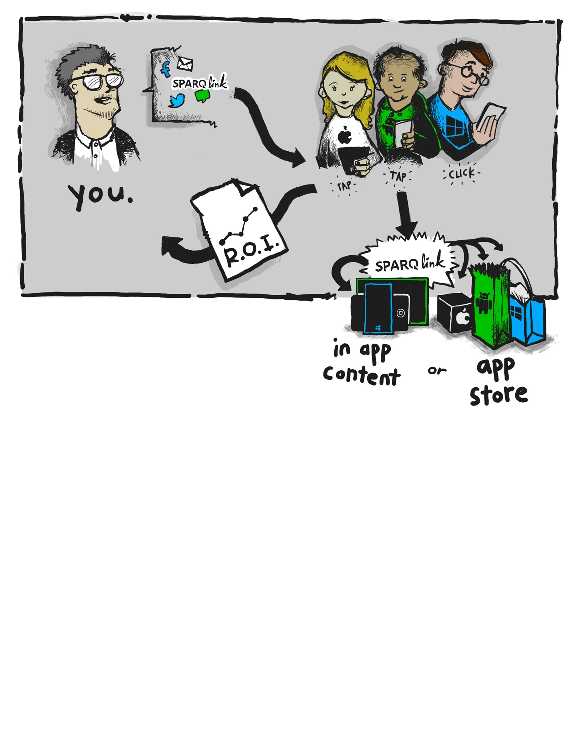
I like to draw cartoons that can explain the value prop. In this case, the link does a lot of work, and the business gets metrics about its users in return.
Sparq had great technology, a solid engineering team and good data. But they needed the product to match that quality. I met with them for a few hours several weeks in a row to help them through. They were able to build a lot based on a few napkin sketches and 3-4 walk-throughs.

We kept drawing the users' decision flow. Should it be a simple screen? Should it be a wizard? Could we automate everything and just report on it later?

I like making the interface match the natural flow when possible. I ended up going with a simple tree diagram with as many defaults as humanly possible. The benefit of this view is you could layer the reporting data onto it as well.
Now the user only has one interface to deal with, and it will match their model.

The final version was very ipad-centric. Giant hit areas, bolder colors. Big buttons. The devs changed the visual style to match Bootstrap's style, so a bit of extra chrome was added, but it looks pretty great.
SQL AZURE MANAGEMENT PORTAL
(now Azure data studio)
I was the lead designer on SQL's first real cloud tool (SQL Azure Management Portal). Since then the teams have greatly improved the surrounding toolsets and interfaces, but it was a good chunk of my life at Microsoft.

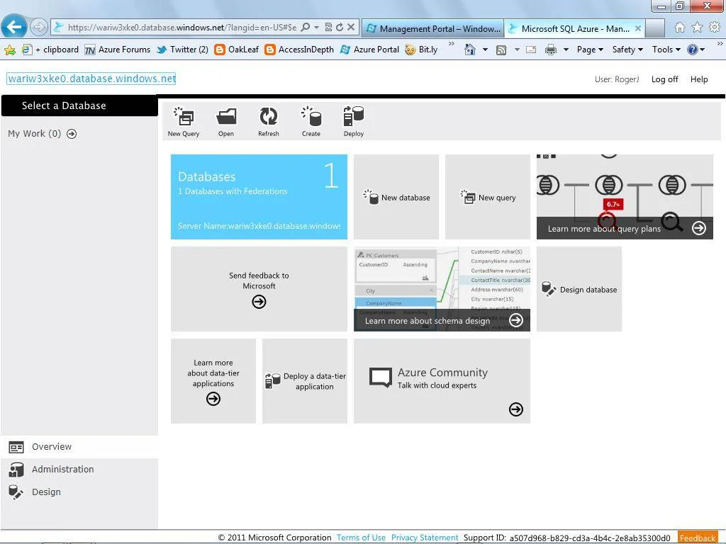
With the advent of tiles in many of Microsoft's system, I believed it would be a good time to use them to promote data to the front so tasks/objects could be smartly selected. With time each tile became less and less connected with that promoted data, and the style took over.
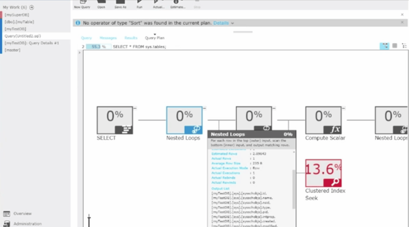
One of the best pieces of the SQL portal was this zoomable query map. A user can look at a query and immediately see where the problems might be in a bunch of different pivots. When they see what they're after, they can zoom in to see more information, and then again to get everything (on hover).
Iconography is by the extraordinarily talented visual designer who reported to me, but the rest is ol' crazy Joe.


Azure federations
In the second version of SQL Azure, we introduced a visual component to database federations (a complicated scale-out mechanism).
While this interface has since been retired, it really gave DBAs an easy way to get started on highly complicated new paradigms in Azure.
Given the advancement of cloud technologies, this would be a really fun problem to look at again with fresh eyes.
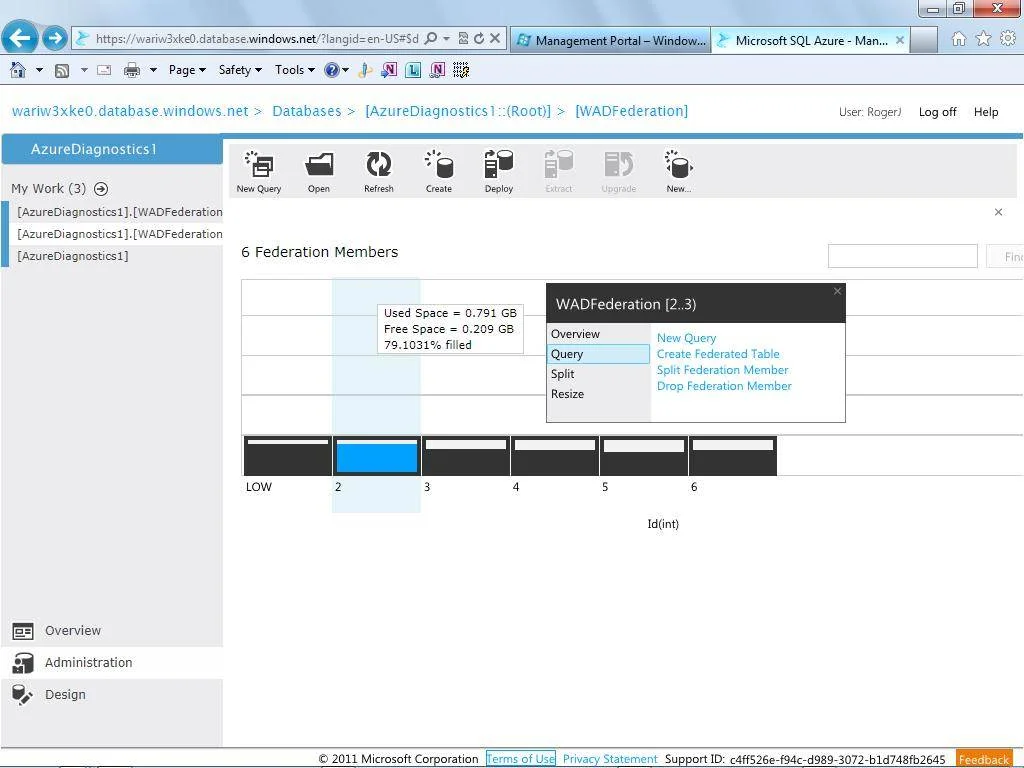

It is not fancy, but a major theme in my work is promoting those top tasks (the overlay) so the user has no need to jump around. It's all right there!
Powerpivot gallery for sharepoint
I designed many galleries for SQL PowerPivot. The reason I still like this one all these years later is the simplicity of its interaction model. It tested very well and still gets positive feedback from users.
Fun fact: I wrote the front-end code which powers this thing.
More nonsense